Prospera Wealth came to us with a clear question: how do you build a wealth management brand that doesn’t just talk about managing money—but consistently reinforces the idea of making wealth prosper? That’s where we started: with meaning, not visuals.
Project Overview
Industry: Wealth Management / Financial Services
Audience: Families, professionals, and long-term investors seeking clarity and trust
Goal: Create a premium brand identity system that communicates stability, growth, and generational security—without feeling transactional or “salesy.”
USP Strip: Strategy-led branding • Built for scale • Designed for conversion
The Challenge
The financial services space is crowded with brands that look overly corporate, cold, or generic. Prospera needed a brand identity that felt credible and structured, but also optimistic—something that visually represents prosperity as an ongoing journey: growing, sustaining, and protecting wealth over time.
Brand Direction
Concept & Meaning
The name Prospera stems from prosperity—not simply having wealth, but nurturing it and securing it for the future. We used that as the foundation for a visual language built around steady progress and clear decision-making.
Personality & Positioning
We crafted the identity to feel calm, confident, and trustworthy—a brand that communicates expertise and clarity, while staying approachable enough for everyday investors.
Visual Identity System
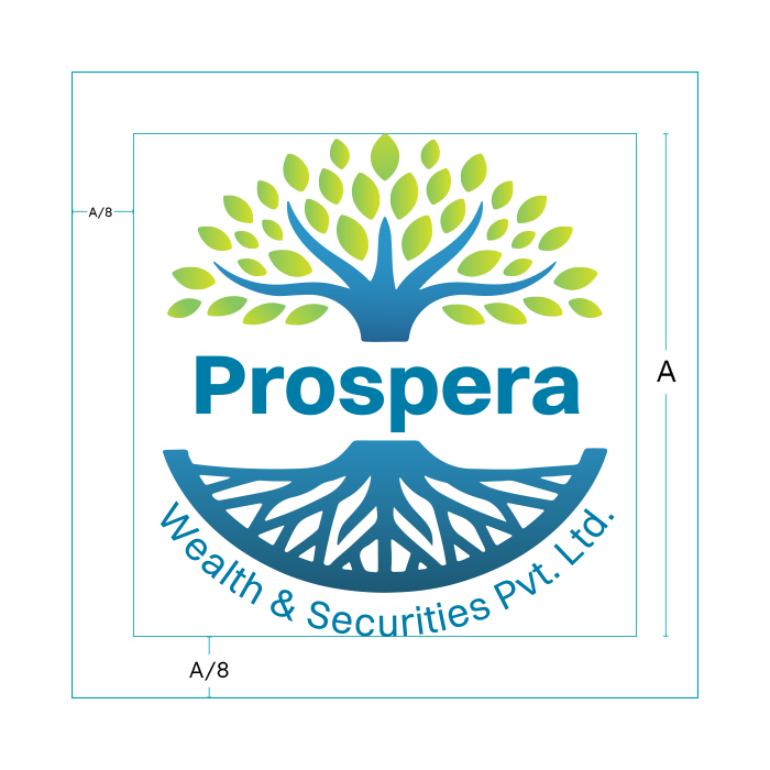
Logo Concept
The logo is more than a tree—it’s a symbol of financial stability and growth. Roots represent existing wealth and strong foundations, while expanding branches represent growth and future outcomes, aligning perfectly with the brand promise of helping people prosper across generations.
Color System
We selected colors that signal reliability, maturity, and steady progress—a palette designed to feel premium, consistent, and timeless across digital and print.
Typography, Layout & Rules
We chose Switzer, a sharp, structured typeface that mirrors a financial strategy: clear, disciplined, and confident. Layout rules were designed to keep communication uncluttered, making the brand feel transparent and easy to trust.
Deliverables
Brand direction and identity concept
Logo design (primary mark + usage approach)
Visual identity system (color, typography, layout rules)
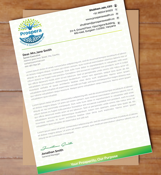
Brand application mockups (where applicable)
Result
The final outcome is a trust-led wealth management brand identity that visually communicates what Prospera stands for: helping clients grow what they already have—securely and clearly. The system is scalable across marketing assets, web, and future collateral, while maintaining a consistent premium look that builds recognition over time.
FAQs
What does branding include for a wealth management firm?
Logo, identity system, messaging direction, and brand rules for consistency.
Can you refresh an existing financial brand without a full rebrand?
Yes—through strategic identity refinement.
Want more like this? View more branding work in our portfolio.
Looking to build a strong, trustworthy brand for your wealth or financial services firm?Let’s create a brand that reflects credibility, stability, and long-term growth.