Brand Identity Design

F&W Branding Case Study

Fashion, fun, and community—wrapped into one bold brand. F&W wanted more than "just a logo." The goal was to build a brand identity that feels affordable yet fashionable, simple yet expressive, and designed to grow with a community-first audience.

Bold Without the Noise
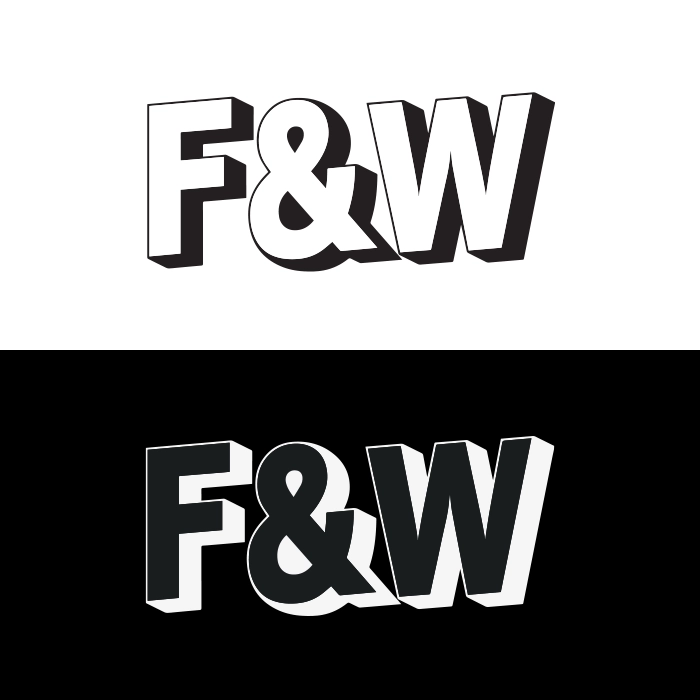
A black-and-white foundation that keeps the brand clean and premium, with colour accents that add energy exactly where they're needed.
Community-First Identity
A personality that's energetic, expressive, and friendly — built for the audience that lives on social, buys on drops, and shares what they love.
Built to Scale
A flexible system with sub-branding capability — strong enough for everyday use, versatile enough to make every campaign and collection feel fresh.

F&W is a fashion and lifestyle brand built around style, value, and social energy — serving trend-aware shoppers who want to look good without the premium price tag.

The goal was to build a playful, vibrant identity system that stands out while staying clean and scalable across digital and print — one that could carry the brand through everyday use, seasonal drops, and future sub-brands without losing coherence.

Industry
Fashion / Lifestyle
Service
Brand Identity Design
Audience
Trend-Aware, Community-First Shoppers
Goal
Bold, scalable identity for digital and print
F&W branding case study design by Outdo Agency

Result / Impact

What We Delivered

F&W now has a scalable identity built for growth — cool, modern, and community-driven without losing clarity. A strong foundational system for everyday use, plus enough energy to make campaigns and collections feel exciting.

Recognition Built In
The black-and-white base keeps the brand instantly recognisable and premium across every format — from product labels to social content — without needing constant reinvention.
Colour That Does Work
Accents add personality and highlight key moments — drops, promotions, social content — so the identity stays clean day-to-day and turns up the energy when it needs to.
Consistent Wherever the Audience Finds Them
F&W can now show up confidently across every channel — fashion-forward and accessible, with a system that builds recall and keeps visuals consistent without extra effort.

Need branding for a fashion or retail brand?

Book a branding call and let's build something bold and scalable.

Many fashion brands either go overly minimal (and feel generic) or overly loud (and feel messy). F&W needed the sweet spot: a strong black-and-white foundation with controlled color accents, delivering a brand that's bold, modern, and instantly recognizable—without losing simplicity.

01
The Generic vs Messy Trap
Fashion branding tends to fall into one of two failure modes — too stripped back to be remembered, or too visually busy to be trusted. Neither works for a brand trying to build real community loyalty.
02
Affordable But Premium-Feeling
F&W's audience wants style and value — which means the brand had to look and feel high-quality without signalling a price point that puts people off. A rare balance to strike in fashion.
03
One System, Many Contexts
The identity had to work across collections, social content, packaging, and sub-brands — which meant building flexibility into the system from day one, not as an afterthought.
Brand Direction

Street Confidence Meets Editorial Structure

We started with curated moodboards to define F&W's visual world — mixing street-style confidence with clean editorial structure. This helped us lock the balance between fashion-forward visuals and an identity that can flex across collections, product labels, packaging, and social content.

Moodboards & Inspiration

Curated references that defined the visual world — where to sit between street energy and editorial polish, and what "affordable yet fashionable" actually looks like on screen and in print.

Personality

F&W's personality is stylish and fun — never boring. We built the identity around a community vibe: energetic, expressive, and friendly. The tone feels bold and fabulous, but still clear enough to support everyday brand applications.
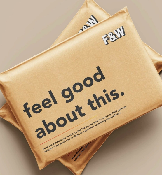
F&W brand design presentation by Outdo Agency
F&W visual branding mockup by Outdo Agency
Visual Identity System

Black, White, and Exactly the Right Amount of Colour

The visual system was built around one core decision: black-and-white creates structure and consistency, then colour appears as an accent — used strategically for highlights, drops, campaigns, or sub-brands — so the identity stays clean while still feeling playful.

Logo & Wordmark

Designed to feel modern and confident — something that looks premium, but still approachable for an affordable fashion brand.

Typography, Patterns & Layout Rules

Typography and layout rules that keep visuals balanced across touchpoints, plus supporting graphic elements and patterns that add personality without overpowering the design.

Sub-Branding System

Where F&W needed sub-branding, we created a flexible approach that keeps the parent brand consistent while allowing collections or categories to have their own visual cues — perfect for launches, seasonal drops, and promotions.

Brand Direction & Moodboards

  • Curated moodboards defining the visual world
  • Personality and tone direction for all brand applications
  • Style references locking the street-editorial balance

Logo & Wordmark Design

  • Primary logo mark and wordmark
  • Colour and mono variants for digital and print
  • Logo usage rules and approved file formats

Visual Identity System

  • Black-white base palette with colour accent rules
  • Typography scale and layout guidelines
  • Supporting graphic elements and patterns

Sub-Branding Direction

  • Flexible sub-brand framework for collections and categories
  • Visual rules for seasonal drops and campaign extensions
  • Parent brand consistency guidelines for sub-brand use

Social Templates & Brand Mockups

  • Social media templates for consistent content creation
  • Brand mockups showing real-world application
  • Source files for handover to marketing and design teams

F&W is a good illustration of what fashion branding actually requires — not just a logo that looks good, but a system built to hold up across the full range of contexts a fashion brand lives in. Product labels, social posts, campaign drops, seasonal sub-brands: they all have to feel like the same brand, even when the energy is different.

The black-and-white foundation solves the recognition problem. The colour accent logic solves the energy problem. And the sub-branding framework solves the scalability problem. Each decision was specific to how F&W actually operates — not a generic fashion brand template.

For fashion and retail brands that want to stand out with a community-first audience, Outdo builds identities that are built to grow — not just to launch.

What This Engagement Included
  • Brand direction and curated moodboards
  • Logo and wordmark — colour and mono variants
  • Visual identity system — black-white base + accents
  • Typography, patterns, and layout rules
  • Sub-branding direction for collections and drops
  • Social templates and brand mockups

Need Branding for a Fashion or Retail Brand?

Book a branding solutions call, and let’s build something bold and scalable.

It typically includes brand direction, logo, visual identity rules, and templates for consistent design across touchpoints.
Yes — sub-branding helps collections stand out while staying tied to the parent identity.
Most projects take a few weeks depending on scope, revisions, and deliverables.