Brand Identity Design

Carnival Empire Branding Case Study

Building a brand that stands out in a world full of digital entertainment was the challenge Carnival Empire brought to Outdo. Their idea was refreshingly different: a 365-day carnival where families and friends can unplug, meet in real life, and make memories through timeless, classic fun.

Instantly Recognisable Identity
A bold, emotionally resonant brand that communicates joy and excitement in one glance — no context required.
Nostalgia-Led Visual World
A visual language rooted in the warmth of traditional Indian fairs — familiar, festive, and built to trigger the right emotions.
Built to Scale
A structured identity system ready to roll out across signage, tickets, digital promotions, and on-ground experiences as the brand grows.

Carnival Empire is an entertainment and family experience brand built around a single, compelling idea: a 365-day carnival that gives families and groups of friends a reason to put down their phones, show up in person, and share something real.

In a space dominated by screen-first experiences, Carnival Empire's positioning is its differentiator. The brand needed an identity that communicated that difference immediately — one that felt nostalgic, joyful, and larger-than-life before a visitor ever walked through the door.

Industry
Entertainment / Family Experiences
Service
Brand Identity Design
Audience
Families, Friend Groups & Nostalgia-Driven Visitors
Goal
Joyful, scalable identity built for immersive rollout

Result / Impact

What the Carnival Empire Brand Delivered

Carnival Empire now has a bold identity that's instantly recognisable and emotionally resonant — built to attract families, spark excitement, and scale into a full always-on carnival brand experience.

A Brand That Communicates Joy Immediately
The identity works before a single word is read — colour, form, and energy come together to signal exactly what Carnival Empire is and why it's different from every other entertainment option competing for the same audience.
Emotional Familiarity at First Glance
Rooted in the visual memory of traditional Indian fairs, the brand triggers genuine nostalgia — giving families and groups an emotional reason to choose Carnival Empire over a screen-first alternative.
Scalable Across Every Touchpoint
From signage and tickets to posters and digital promotions, the identity system is structured to roll out consistently — so the brand experience on-ground matches what visitors encountered online.

Building an entertainment or experience-led brand?

We'll help you create an identity that people feel before they read a word.

When most "fun" brands compete through technology, Carnival Empire needed the opposite: a brand that instantly communicates authentic, all-day joy without relying on screens. The identity had to feel immersive, memorable, and emotionally familiar — something people recognise and feel excited about in one glance.

01
Standing Out Without Screens
In an entertainment market saturated with tech-led experiences, the brand had to communicate real-world joy without referencing digital — a harder visual problem than it sounds.
02
Nostalgia Without Looking Dated
The brief called for a vintage, traditional feel — but the brand still needed to feel contemporary enough to attract modern families and work across digital promotion channels.
03
Energy That Scales Consistently
A carnival identity needs to hold its energy across very different formats — from a 10-foot entry arch to a 1-inch ticket stub to a social media post — without losing coherence or impact.
Brand Direction

Nostalgia & Celebration as the Foundation

We built the direction around nostalgia and celebration, inspired by the vintage charm of traditional Indian fairs. The goal was to create a visual language that evokes energy, warmth, and joy — while still being structured enough to scale across signage, tickets, posters, digital promotions, and on-ground experiences.

Cultural Reference Point

Traditional Indian melas and carnival fairs provided the emotional and visual foundation — familiar enough to trigger memory, distinct enough to feel like a world of its own.

Tone

Joyful, festive, and larger-than-life. Every brand decision was tested against one question: does this feel like the most fun place in the room?

Visual Identity System

A Logo Built Like a Celebration

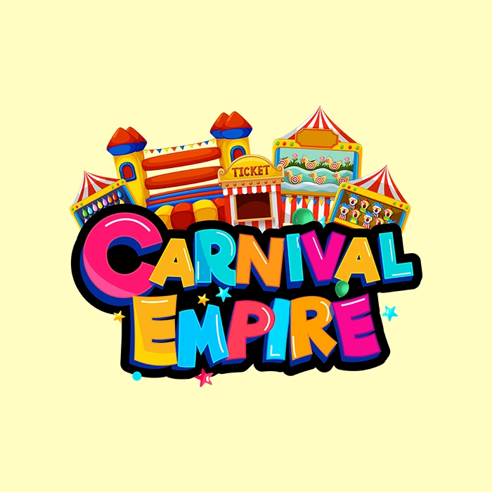
The logo was designed as a celebration — colourful, festive, and packed with carnival energy. From bright, dynamic branding to immersive design elements, every component was crafted to transport visitors into a world where fun is timeless.

Logo Concept

A mark designed to feel festive and immediately recognisable — built to hold its energy at any scale, from a large format banner to a small digital icon.

Color & Energy

A bright, dynamic palette chosen to communicate joy and excitement — replacing the muted, screen-era aesthetic with something warm, vivid, and physically present.

Brand Identity Direction

  • Nostalgia-led visual world rooted in traditional Indian carnival culture
  • Brand tone and energy guidelines for consistent expression
  • Positioning direction for how the brand communicates across contexts

Logo Concept & Application System

  • Primary logo mark designed for multi-scale application
  • Colour and mono variants for different use contexts
  • Logo usage rules for on-ground, print, and digital formats
  • Approved file formats: SVG, PNG, PDF

Visual Language for Immersive Rollout

  • Design system for signage, tickets, and on-ground materials
  • Digital and social media application guidelines
  • Brand guidelines document for handover to production teams

Carnival Empire is a reminder that the strongest brand identities are built around a feeling, not a feature. In a category where most competitors are adding screens, the decision to go the other direction — warmth, nostalgia, and real-world joy — was always the right one. The identity just had to be strong enough to make that decision legible at a glance.

By grounding the visual world in the emotional familiarity of traditional Indian fairs and building a system structured enough to scale, Outdo gave Carnival Empire a brand that works as hard in a digital thumbnail as it does on a 10-foot entry arch.

For entertainment and experience-led brands, the brand isn't just marketing — it's part of the experience itself. Getting it right from the start matters.

What This Engagement Included
  • Nostalgia-led brand identity direction
  • Logo mark — primary, mono, and usage variants
  • Colour palette and visual energy system
  • Application system for on-ground and digital formats
  • Brand guidelines document and source files

Need Branding for an Entertainment or Experience-Led Brand?

Book a branding call with Outdo. We'll build an identity that people feel before they read a word.

Branding typically includes logo design, visual identity direction, and scalable design rules that keep every touchpoint consistent across offline and digital marketing.
By using familiar cultural cues and vintage inspiration, then refining it with modern layout rules, strong typography, and controlled design systems.
Yes. Outdo Agency supports branding projects across India, Australia, and the UAE with identity systems designed to scale across regions. View more branding work in our portfolio →