Brand Identity Design

Bloom Branding Case Study

Bloom is a healthcare brand operating in autism therapy — a space where parents make emotionally loaded decisions. Outdo built a brand identity that leads with warmth and trust, replacing a clinical aesthetic with a human, credible presence that families feel confident choosing.

Trust-Led Positioning
A brand strategy built around warmth, credibility, and care — helping families feel confident choosing Bloom.
Empathetic Brand Messaging
A reassuring tone of voice that makes parents feel supported rather than overwhelmed by clinical language.
Distinct Visual Identity
Replaced the traditional clinical aesthetic with a welcoming identity that reflects growth and transformation.
Consistent Brand System
A scalable identity system applied consistently across digital and offline touchpoints as the clinic grows.

Bloom is a therapy clinic specialising in autism care for children — a sector where the brand is not just a visual identity but a signal of safety. Parents choosing a therapy provider are making one of the most emotionally significant decisions of their lives.

The existing identity leaned too clinical. It communicated expertise but not warmth — and for this audience, warmth is the first filter. Outdo was brought in as a brand identity design agency to reposition Bloom as a place where children are understood and parents feel confident from the very first interaction.

Industry
Healthcare / Autism Therapy
Service
Brand Identity Design
Audience
Parents & Families of Children with Autism
Goal
Warm, credible identity that builds trust from first contact

Result / Impact

What the Bloom Brand Delivered

The final outcome is a trust-led healthcare brand identity that feels human and hopeful — helping families feel safer taking the first step, and helping the clinic present itself consistently as it grows.

Trust-Led Positioning
A brand strategy built around warmth, credibility, and care. Families now encounter a brand that signals safety before a single word is read — reducing hesitation at the critical first touchpoint.
Empathetic Brand Messaging
A tone of voice that speaks to parents as partners, not patients. Every message is designed to reduce anxiety and invite engagement — without sacrificing clinical authority.
Distinct Visual Identity
A welcoming visual system that replaces sterile medical cues with warmth and optimism — reflecting what families hope for when they walk through the door for the first time.
Scalable Brand System
A documented identity system — logo, color, typography, tone — that Bloom's team can apply consistently across signage, digital, print, and internal communications as the clinic expands.

Building a healthcare or therapy brand that needs to earn trust?

We'll help you create an identity that families feel before they read a word.

Bloom wasn't just a therapy company — it needed to feel like a place where children are understood and parents feel confident choosing care. The existing identity leaned too medical, while families were looking for reassurance, clarity, and emotional safety. The job was to balance expertise with empathy so the brand communicates care without losing credibility.

01
Clinical Identity, Wrong Emotion
The existing branding felt sterile and medical — appropriate for a hospital, not a therapy space where families need to feel welcomed and understood.
02
High Emotional Stakes, Low Trust Signals
Parents choosing autism therapy are navigating significant anxiety. The brand had to reduce uncertainty and build confidence from the very first interaction — before a call is ever made.
03
Credibility vs Warmth Tension
Too warm and the brand risks looking unprofessional. Too clinical and it loses the emotional connection families need. The identity had to hold both without compromising either.
Brand Direction

Strategy & Positioning

We started with the name. "Bloom" signals growth and transformation — exactly what families hope for when starting therapy. That single word anchored the entire brand direction: optimistic, forward-looking, and grounded in real outcomes for children.

Positioning was defined as: a therapy space where trust begins — warm, supportive, and professional. Messaging was intentionally gentle and inviting so parents feel reassured, not overwhelmed, when they encounter the brand for the first time.

Name Meaning

Bloom signals growth and transformation — the emotional outcome families are investing in when they choose therapy for their child.

Tone of Voice

Gentle, clear, and grounded. Avoids clinical jargon. Speaks to parents as partners in their child's progress — not as patients navigating a system.

Visual Identity System

Logo, Color & Typography

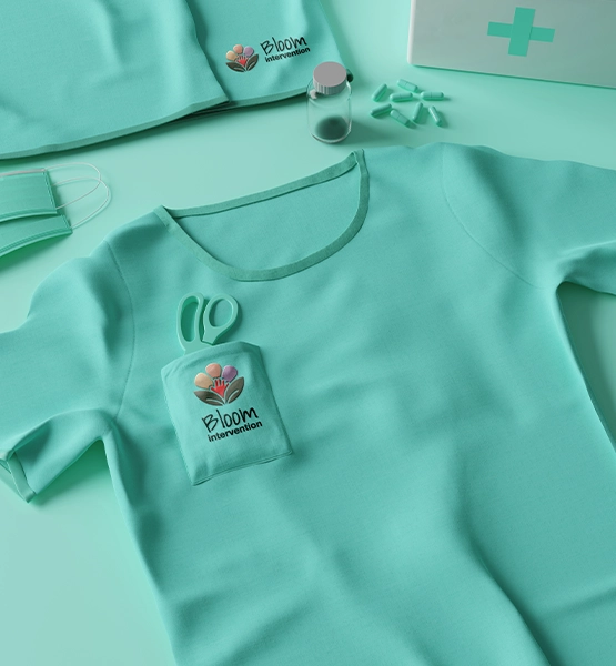
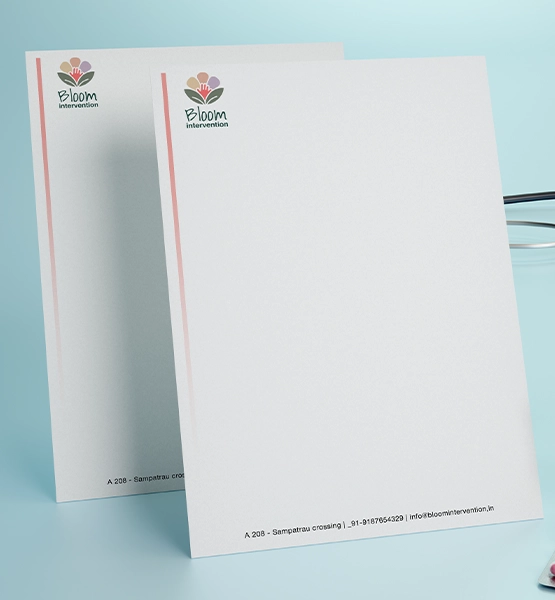
Every visual decision was made against one question: does this feel safe to a parent encountering it for the first time? The result is a system that is warm without being childish, and professional without being cold.

Logo Concept

A soft, optimistic mark designed to feel friendly and safe — instantly recognisable across signage, print, and digital. Avoids sharp geometry and hard contrasts that read as clinical.

Color Logic

A soothing palette that replaces the sterile medical feel with calm confidence — approachable enough to invite families in, structured enough to maintain credibility as a professional therapy provider.

Typography

Clean, readable, and warm. Type choices reinforce accessibility and clarity — prioritising ease of reading for parents who are often processing a lot of information under stress.

Brand Strategy & Positioning

  • Audience and emotional landscape research
  • Positioning statement and brand narrative
  • Tone of voice guidelines with example copy
  • Brand promise and core messaging pillars

Logo Design & Usage

  • Primary logo mark with full-colour and mono variants
  • Logo clear space and minimum size rules
  • Approved logo file formats: SVG, PNG, PDF
  • Usage guidance for digital and print contexts

Color & Typography System

  • Primary and secondary color palette with hex values
  • Color usage rules for backgrounds, text, and accents
  • Typography scale — heading, subheading, body
  • Font pairing with weights and spacing guidance

Brand Messaging Direction

  • Core brand message and tagline options
  • Tone guidance for website, social, and print copy
  • Language to avoid — clinical terms and cold phrasing

Brand Application Mockups

  • Mockups showing brand applied to real-world touchpoints
  • Signage, stationery, and digital format previews
  • Social media profile and cover application examples

Brand Guidelines Document

  • Single-source PDF covering all identity rules
  • Ready for handover to web, print, and marketing teams
  • Editable source files in Figma for future use

Bloom demonstrates how effective brand identity design goes beyond logos and colors. For organisations operating in highly emotional sectors — healthcare, therapy, child services — branding must create confidence, reduce uncertainty, and build meaningful connections from the very first interaction.

By combining strategic positioning, empathetic messaging, and a carefully crafted visual identity system, Bloom evolved from a therapy provider into a brand experience that families can trust. The result is a stronger, more human-centered identity that reflects the care, expertise, and support Bloom delivers every day.

Whether you're launching a new healthcare brand or repositioning an existing one, Outdo builds brand identities that earn trust before a single conversation takes place.

What This Engagement Included
  • Brand strategy, positioning & audience research
  • Logo design — primary, mono, and usage variants
  • Full color and typography system
  • Messaging tone direction and language guidance
  • Brand application mockups across touchpoints
  • Brand guidelines document — PDF and Figma source

Need Brand Identity Design for a Healthcare or Therapy Brand?

Book a branding call with Outdo. We'll help you build an identity that earns trust from the very first interaction.

Branding for a therapy clinic covers positioning, messaging tone, and a full visual identity system — including logo, colors, and typography. The goal is to create a consistent, trust-building presence across every touchpoint families encounter, from the first Google search to the reception wall.
Empathy-first messaging paired with calming visuals — while retaining structure and clarity for credibility. The language avoids jargon, the palette avoids sterile tones, and the logo avoids clinical geometry. The system holds warmth and professionalism together rather than trading one for the other.
Yes. Outdo Agency supports cross-region branding with scalable identity systems built for teams operating across multiple markets. We work with clients across India, Australia, and the UAE. View more branding work in our portfolio →