Audience: Parents and families seeking a safe, reassuring therapy environment for children with autism
Goal: Create a warm, credible brand identity design system that feels supportive—not clinical—and builds trust from the first interaction.
The Challenge
Bloom wasn’t “just a therapy company”—it needed to feel like a place where children are understood and parents feel confident choosing care. The existing identity leaned too medical, while families were looking for reassurance, clarity, and emotional safety. As a brand identity design agency, our job was to balance expertise with empathy so the brand communicates care without losing credibility.
Brand Direction
Name Meaning
The name “Bloom” signals growth and transformation—exactly what families hope for when starting therapy.
Positioning
A therapy space where trust begins—warm, supportive, and professional. Messaging was intentionally gentle and inviting so parents feel reassured, not overwhelmed.
Visual Identity System
Logo Concept
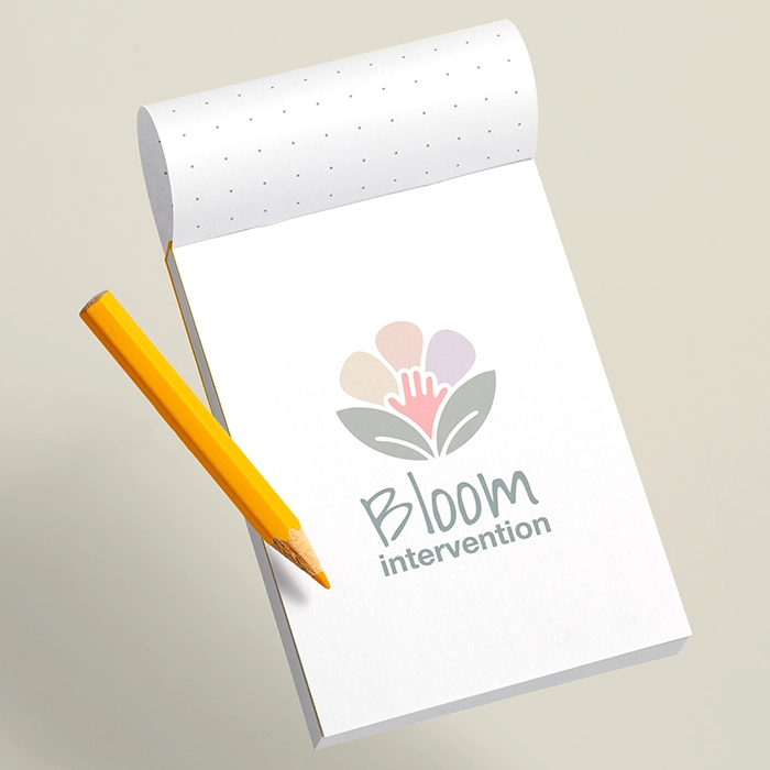
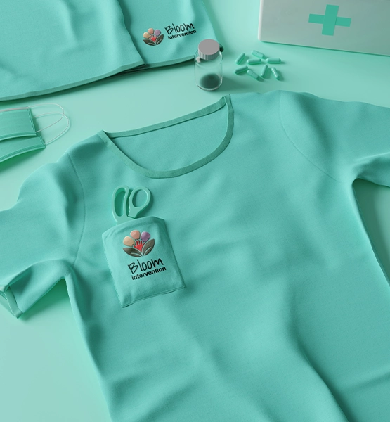
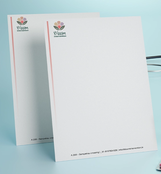
A soft, optimistic mark designed to feel friendly and safe—created to be instantly recognizable across signage, print, and digital touchpoints. Color Logic
A soothing palette that replaces the “sterile medical” feel with calm confidence—helping the brand feel approachable while staying credible.
Deliverables
Brand strategy direction + positioning
Logo design + usage guidance
Color + typography system
Brand messaging tone direction
Brand application mockups (where used)
Result / Impact
The outcome is a trust-led healthcare brand identity that feels human and hopeful. Bloom now communicates warmth, credibility, and care in one cohesive system—helping families feel safer taking the first step, and helping the clinic present itself consistently across channels as it grows.
FAQs on Brand Identity Case Study
Q1: What does branding include for a therapy clinic?
Positioning, messaging tone, and a visual identity system (logo, colors, typography) for consistent trust-building. Q2: How do you make healthcare branding feel less clinical?
Use empathy-first messaging + calming visuals while keeping structure and clarity for credibility. Q3: Do you work with brands in India, Australia, and the UAE?
Yes—Outdo Agency supports cross-region branding with scalable identity systems.